A finished product with nothing to show for it.
The team arrived with the engineering solved — LED hydration reminders, built-in UV-C purification, Bluetooth sync — a utility patent, and a page of concept sketches. What they had for visuals were prototype photos taken on a phone.
The problem was never the product, it was the platform. Kickstarter backers decide in seconds, and there were already dozens of competing smart bottles a scroll away. We sat down together and worked out what would make someone stop — starting from the patent drawings and the sketches they walked in with.
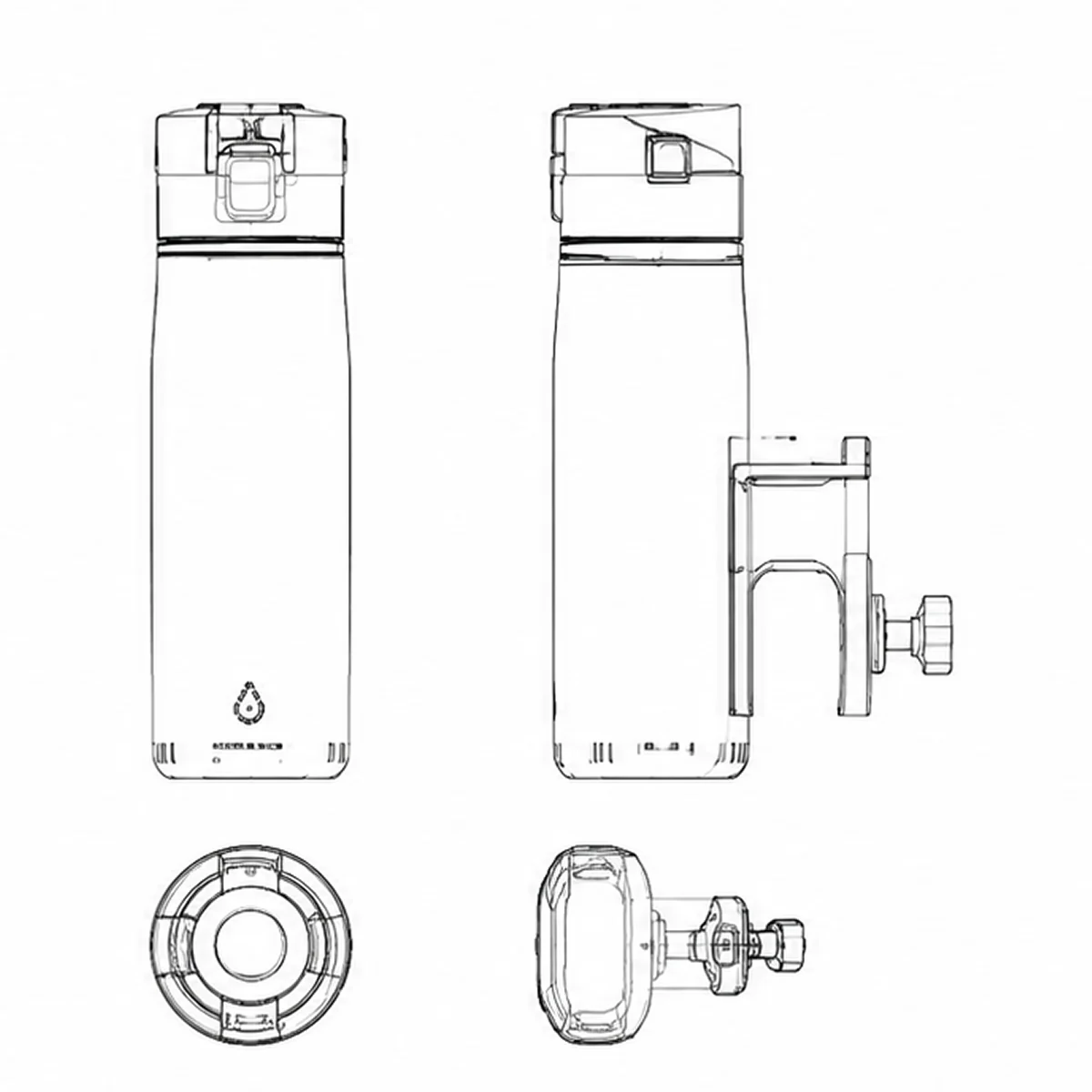
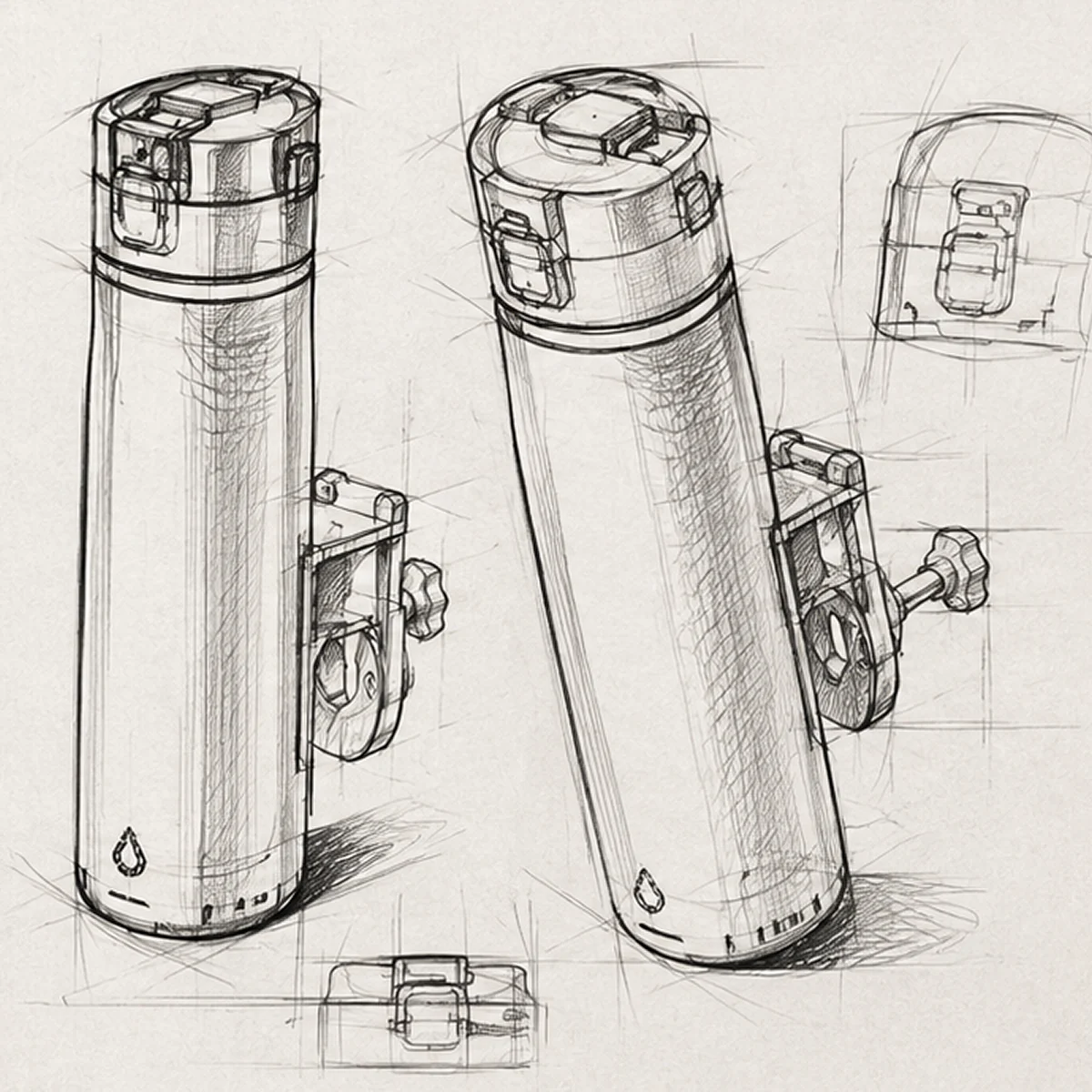
Left: the utility patent figures. Right: the concept sketches we worked from.
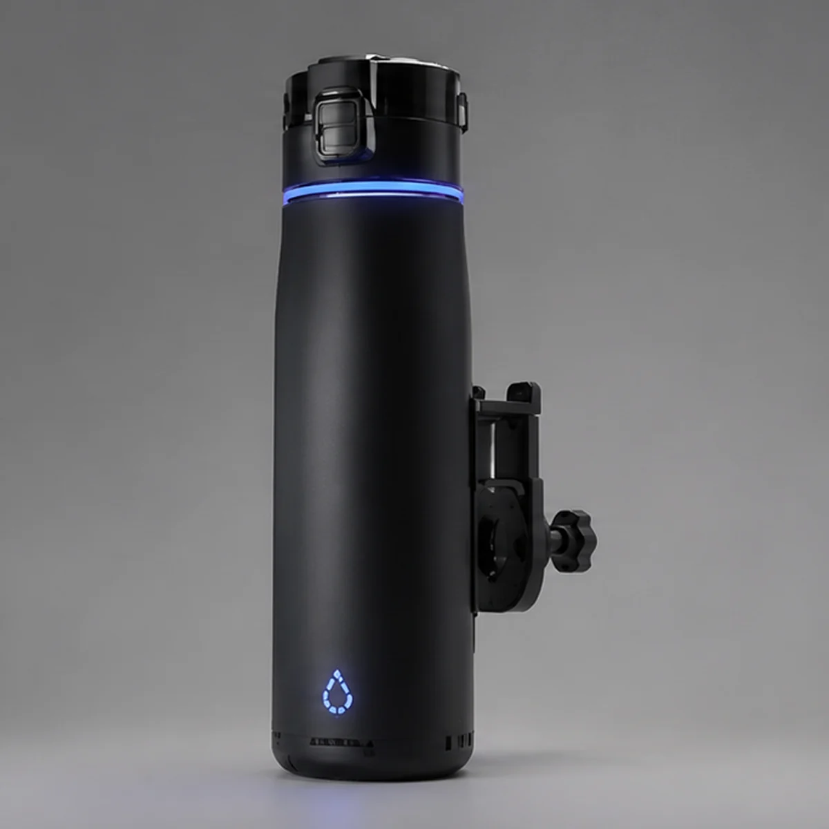
The first render that looked like something you could buy.
We modelled the bottle from the patent geometry and the sketches — the matte body, the cap mechanism, and the illuminated tracking ring that makes the entire idea legible in a single glance.
This became the master asset. Every colourway, every campaign image, and every section of the Kickstarter page was rendered from this one model, which is what kept the whole launch visually consistent.
A brand backers could picture in their own life.
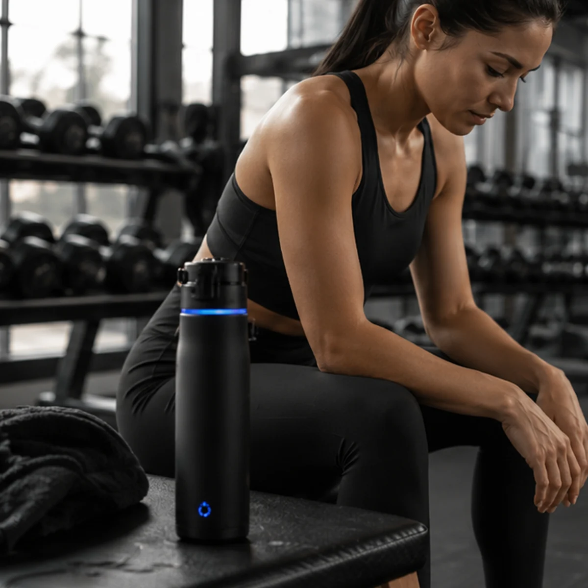
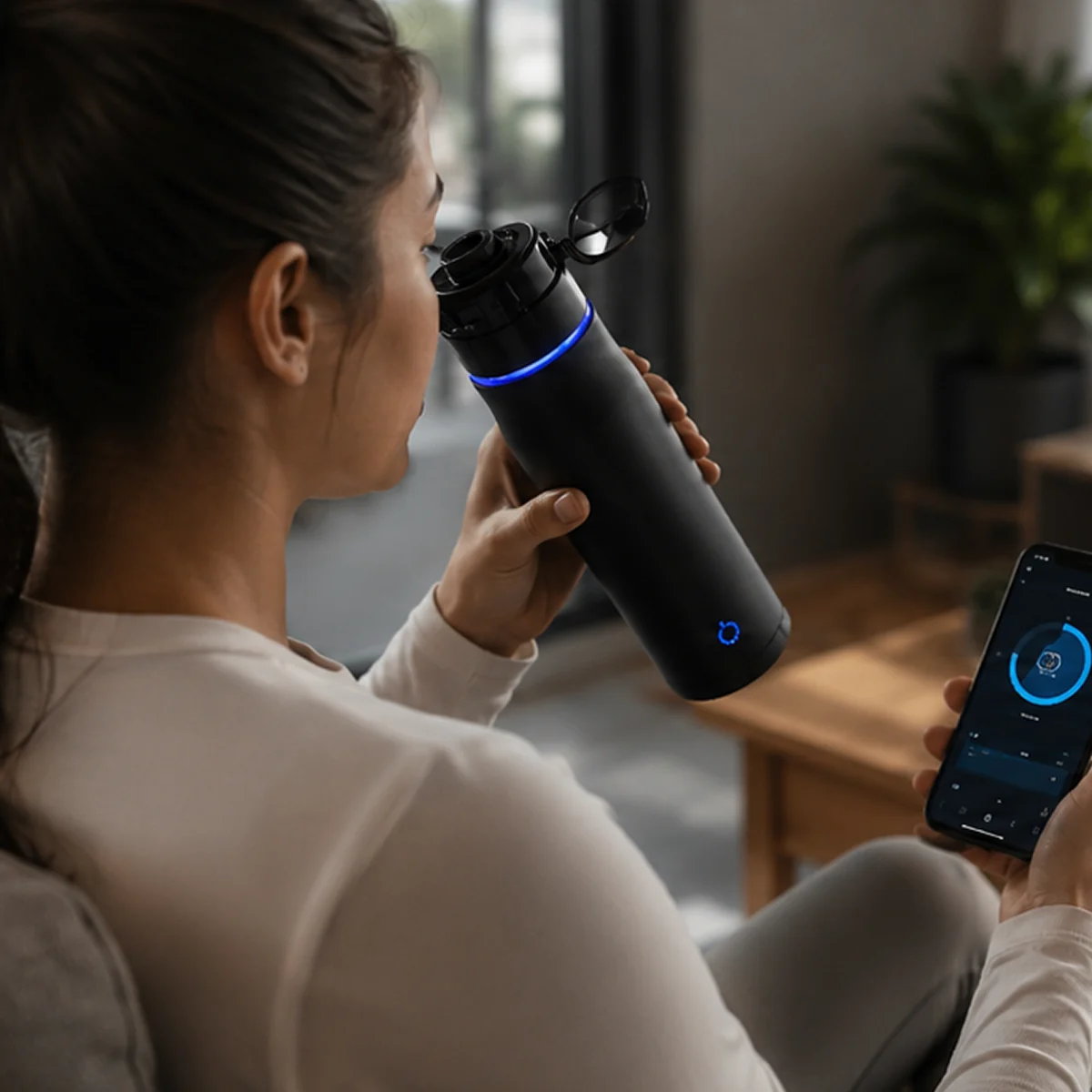
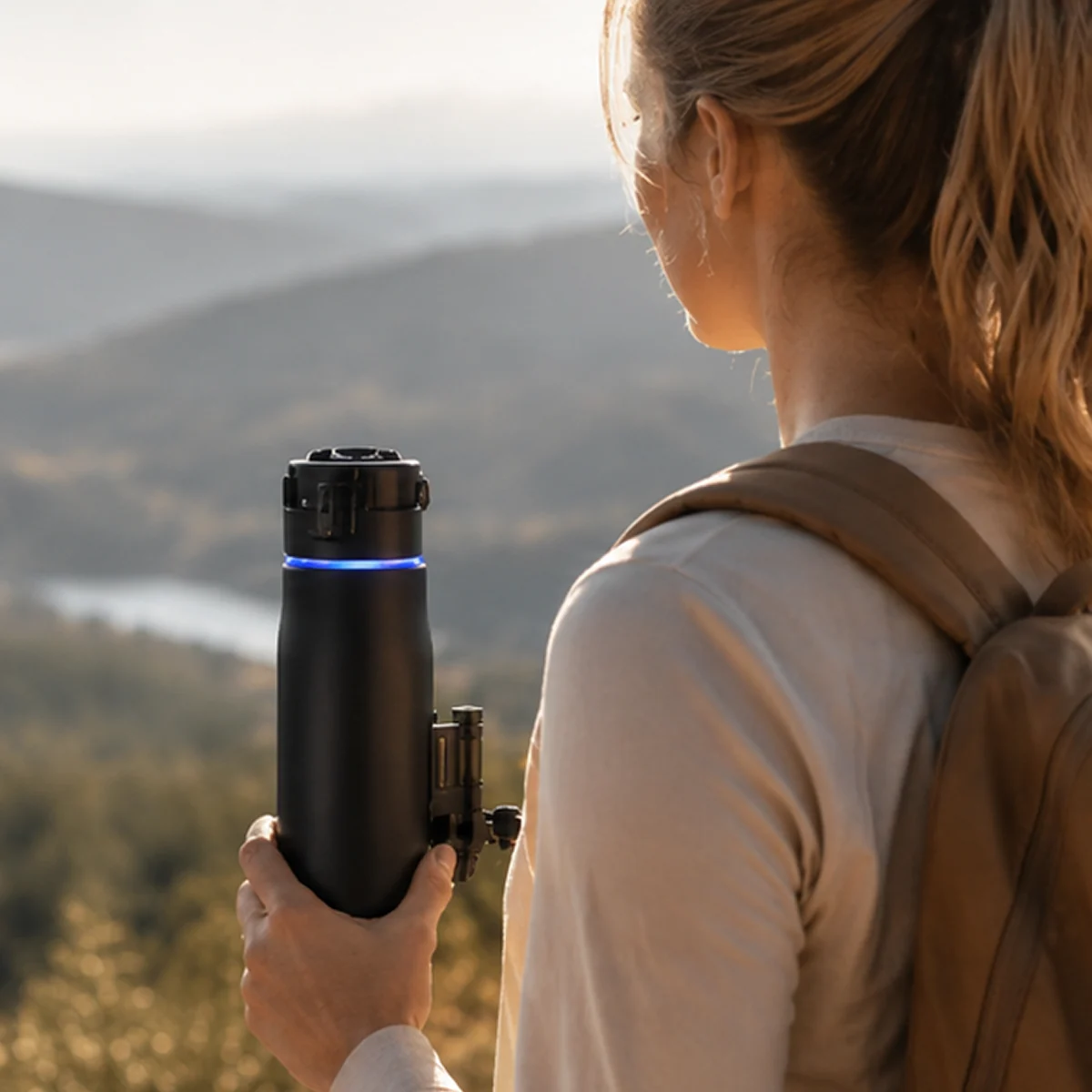
A bottle on a black background does not tell anyone why they need it. So the final stage put the product where it earns its place — on a gym bench, in an everyday routine, on a trail at first light.
The app pairing shot does the heavy lifting: it is the thing that separates this from every other bottle on the platform. Together these images carried the campaign page, the reward tier graphics, and the press kit.
Fully funded. Featured everywhere.
"We hit our funding goal in four days. The renders were the reason — backers could see exactly what they were getting before a single unit existed."— Priya N., Co-Founder, EcoPulse